|
|
Post by chiefsspeedshop on Feb 6, 2009 18:43:33 GMT -6
Only one word AWESOME!!!!!!!!!!!!!!!!!!!!!!!!!!!    This is TRULY A PIECE OF ARTWORK,can't wait to see this one finished ................................Chief |
|
|
|
Post by mykturk on Feb 6, 2009 22:35:43 GMT -6
It's orangey, orangey, orangey good!
|
|
|
|
Post by ira on Feb 7, 2009 14:35:02 GMT -6
Headlight Suggestion:
How about painting the bottom section of the nose black, like a road racing spoiler, and have dual round headlights hanging inside the dark nose opening?
|
|
|
|
Post by ira on Feb 7, 2009 14:37:32 GMT -6
Sorry, The above Suggestion was for Hobby Bobby's last post.
|
|
|
|
Post by scurvy on Feb 7, 2009 15:41:50 GMT -6
That's sexy, Bobby... like a Corvette version of the BMW M-Coupe
|
|
|
|
Post by stevielewis on Feb 7, 2009 17:45:48 GMT -6
I know it's for the Vett*Van contest, but what you have here, Bobby, is a great looking custom showcar Vett. To me, it looks like how the Corvette should look sometime in the next 4 to 8 years. Wild man! ;D  |
|
|
|
Post by JerryG on Feb 10, 2009 7:37:10 GMT -6
That is coming along nice. Really looks good!
|
|
|
|
Post by hobbybobby on Feb 10, 2009 17:47:06 GMT -6
Thank you very much!  More progress. The masquerade is ready, finally.  The Pic`s: 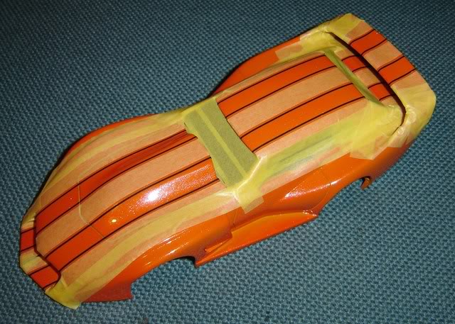 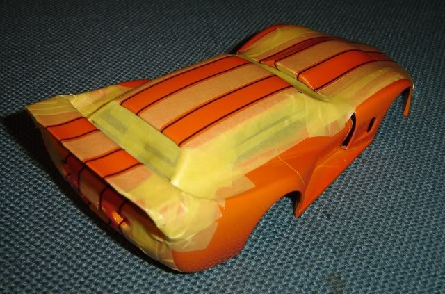  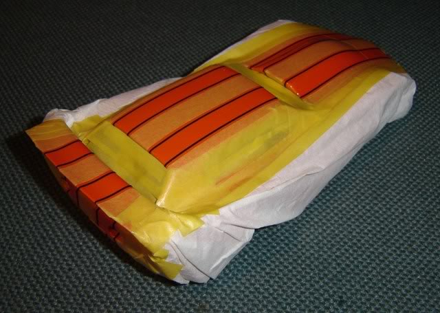 I hope now, that nothing will go wrong...  |
|
|
|
Post by hobbybobby on Feb 12, 2009 6:15:07 GMT -6
More progress: 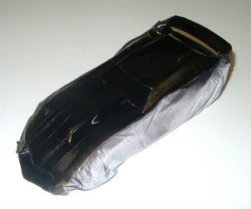 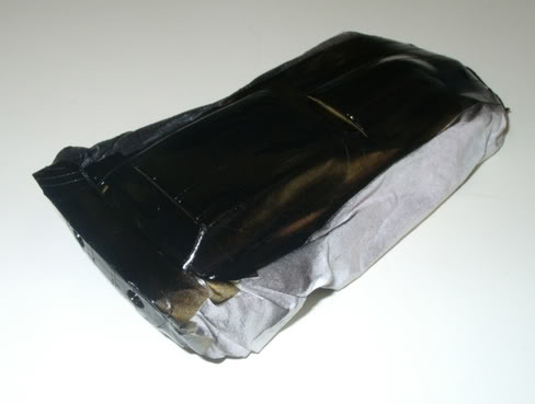 Everything went well, the colors seem to tolerate each other. It looks so after removing the masquerade: 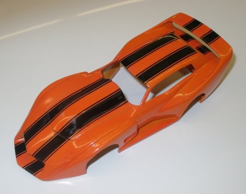 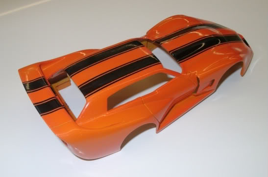 Hope, you like it so far. |
|
|
|
Post by ironheadchopper on Feb 12, 2009 6:31:47 GMT -6
That paint is awesome, Nice job.
|
|
|
|
Post by vwcamperman on Feb 12, 2009 7:27:50 GMT -6
looking GREAT Bobby!! I think it'll need a mascot between the stripes on the piece in front of the hood
|
|
|
|
Post by vwcamperman on Feb 12, 2009 7:39:28 GMT -6
That's sexy, Bobby... like a Corvette version of the BMW M-Coupe I was wondering, were you thinking of the z3 or z4? i always liked the z3 coupe, and the racing ones look amazing  |
|
|
|
Post by smartresins on Feb 12, 2009 12:52:49 GMT -6
That vette is certainly startimh to take real nice shape!!Jody
|
|
|
|
Post by flounder on Feb 12, 2009 20:47:42 GMT -6
Wooooooooooow. So very, very kool. Beautiful and wicked at the same time.
|
|
Deleted
Deleted Member
Posts: 0
|
Post by Deleted on Feb 12, 2009 22:24:24 GMT -6
That turned out excellent! It's coming along great Bobby...  |
|
juhap
Showrod Basher
  
Posts: 63
|
Post by juhap on Feb 15, 2009 11:06:23 GMT -6
I had one Vettevan, too... But after a serious accident it became a parts car for Vette Daytona! But seeing this thread I decided to renovate it! Here you are... Car behind is a new donor model.  |
|
|
|
Post by hobbybobby on Feb 18, 2009 6:12:29 GMT -6
|
|
|
|
Post by badroadahead on Mar 27, 2009 10:03:26 GMT -6
I found this pic of: Joel Dirnberger's Corvette fantasy station wagon. I think either the wood should extend to the rear or remove it all together. I don't think the color compliments it either, but I like the shape. Dave  |
|
|
|
Post by chiefsspeedshop on Mar 27, 2009 10:49:40 GMT -6
I like the CONCEPT of it and the lines look nice from what I can see, BUT YEAH the wood needs to cover the entire side or remove it and the COLOR  ?    I would have choose a more attractive Chevrolet color to put on this,my 3 cents,..................................Chief |
|
|
|
Post by vwcamperman on Mar 27, 2009 17:23:53 GMT -6
|
|
|
|
Post by barten on Mar 29, 2009 18:52:41 GMT -6
BOBBY. . . I knew you could make something cool from the parts I sent you. . . I love the stripes and the colors!
VERY COOL. . . As usual! ;D ;D ;D
GB
barten
|
|
|
|
Post by moparmarc on Apr 6, 2009 14:24:26 GMT -6
What a great job you are doing with the Vette. I love the flow of the lines and how everything looks!!
|
|
|
|
Post by hobbybobby on May 3, 2009 14:20:21 GMT -6
Thanks!  More progress: This is the original `75er Corvette interior. I have it made, in the opinion, it fits. 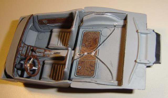 The dashboard and the side panels do this very well... 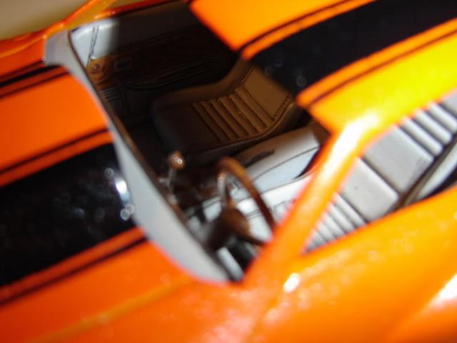 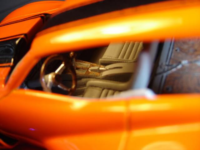 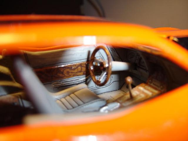 ...but the rear part did not fit. It is in this next picture, right in the middle to recognize. The upper edge of the body is about 10mm higher than the interior. 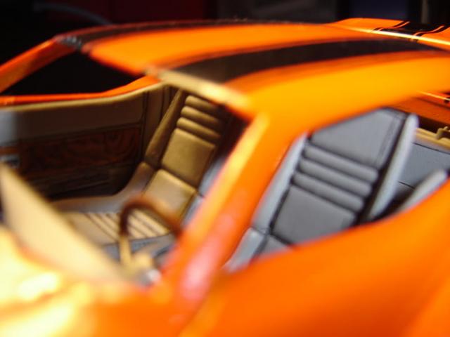 The second consideration was, now it's quite an "van", so more seats can be placed. So, the new interior, goes, somehow in this direction: 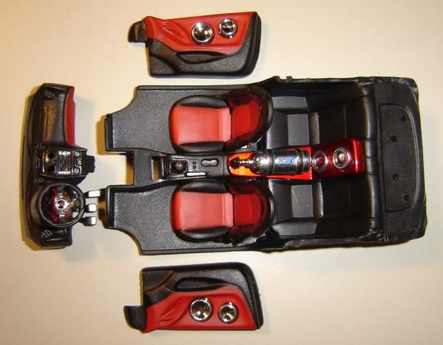 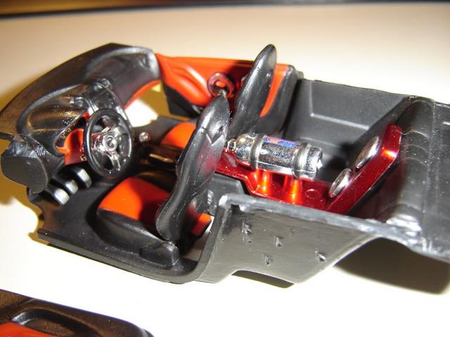 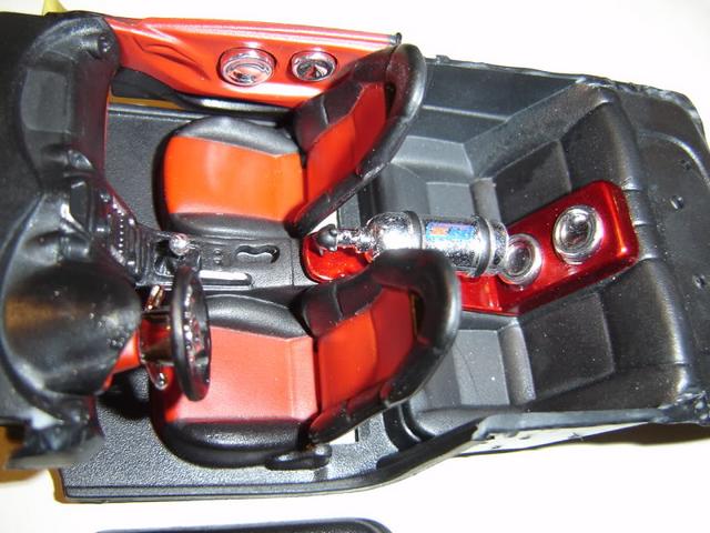 Hope, you like it. |
|
|
|
Post by sakke on May 3, 2009 14:32:23 GMT -6
I think that second interior option looks better than first one. Modern touch insideand outside. It will be a perfect one as usual from you.
|
|
|
|
Post by davea on May 3, 2009 15:39:48 GMT -6
Second option looks good.
|
|
|
|
Post by barten on May 4, 2009 7:31:23 GMT -6
Second . . . killer stuff! As usual
GB
barten
|
|
|
|
Post by moparmarc on May 4, 2009 13:50:37 GMT -6
I like the second interior better myself!
|
|
|
|
Post by hobbybobby on Mar 1, 2010 18:40:29 GMT -6
|
|
|
|
Post by ira on Mar 1, 2010 18:53:38 GMT -6
[glow=red,2,300]Looks Great Bobby!!![/glow]
|
|
|
|
Post by davea on Mar 1, 2010 19:24:51 GMT -6
Sure looks sweet!
|
|
